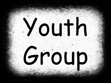
Let's cover fonts first. A lot of youth workers will build their presentations using only the fonts that are preloaded on their computer. Here's a simple slide I made using "Comic Sans" - the go-to font for children's and youth ministries:
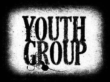
Now, here's the same slide, but I switched the font to a free one I found called "Dead Secretary" (not crazy about the name):
Here's a few more quick font tips:
1. Don't be afraid to use two different fonts in a presentation (NO MORE THAN TWO!). Use an elaborate font for the title/headline, and another easier-to-read font for the body. For example, type your Scripture up using a large, elaborate font for the reference (i.e. John 3:16), and a smaller simpler font for the text.
2. Try moving the font around on the slide. Align it left, right, center, top, and bottom to see where it is the most eye-catching.
3. If it works, make the font slightly transparent. Allowing a little bit of the background to seep through can add some texture to your words and makes it look more like a custom graphic instead of something you typed up on your own.
Good luck, and get creative!


 RSS Feed
